The website for Tech 4 Social Good, a University of Michigan org that frames STEM in its social and cultural context. As co-president, I designed and built it as part of a wider rebrand to bring in new members, alongside digital ads and Diag board banners.
SKILLS: Brand Identity, Web Design, Information Architecture, Campaign Design
01 / THE PROBLEM
⋆。°✩ WHERE WE STARTED
As a freshman choosing clubs, the first thing I did was look up their websites, and ours never quite caught my attention, which felt like a missed opportunity for a tech club. Engagement had been declining for a year, and a site that genuinely drew people in seemed like the right place to start.
Old website homepage
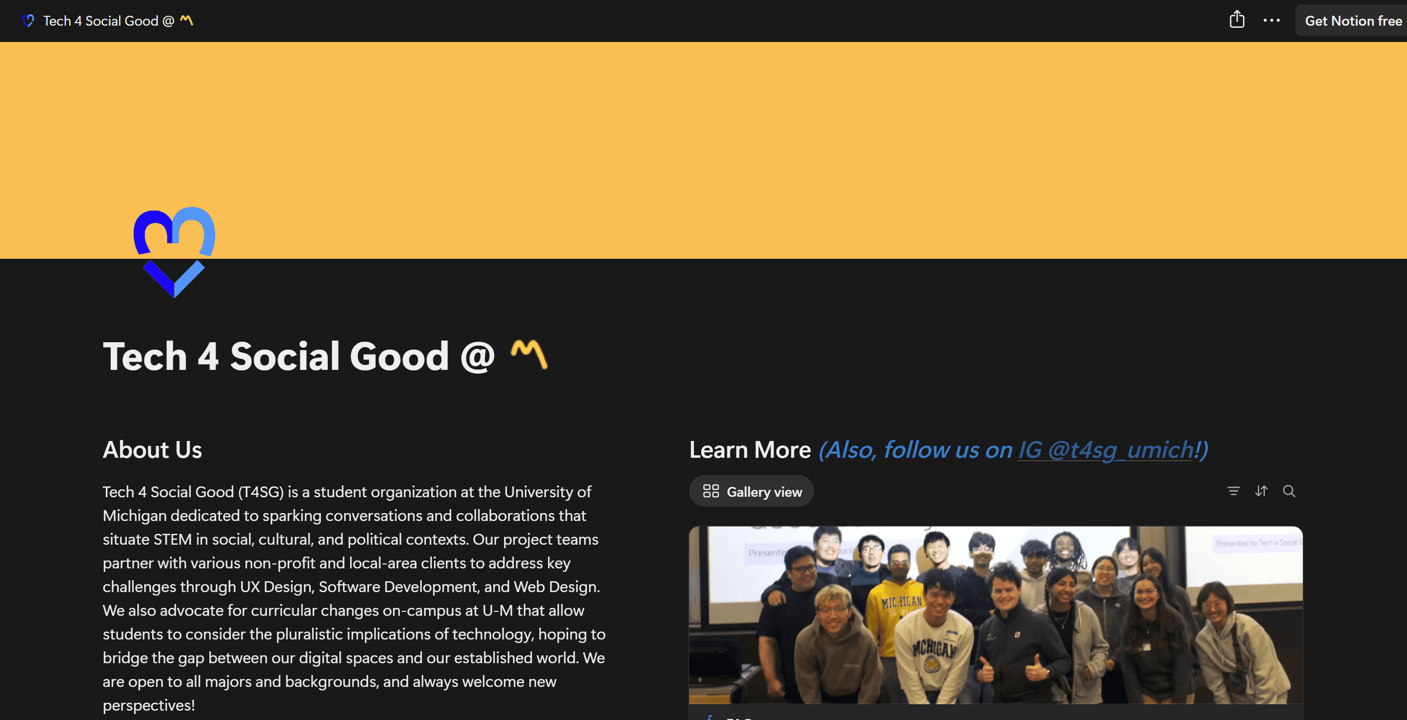
Old website project page (empty projects)

⋆。°✩ THE REAL PROBLEM
This was about more than a better-looking page. We are open to everyone, no experience required, while many clubs at Michigan feel selective. The site needed to look credible enough to be taken seriously and warm enough that a first-year with no experience would still feel welcome. That balance shaped nearly every decision.
KEY INSIGHT
02 / THE BRAND
⋆。°✩ A BRAND THAT LOOKS HANDMADE ON PURPOSE
The brand is built from elements that are distinctly ours, a heart logo, doodles, stars, and friendly blues. The handmade feel is intentional. A polished, corporate look can read as exclusive, while something more personal signals made by students, for students, with social impact at the center.

01
HEART LOGO
Keeps social impact at the center of the brand, not buried in a tagline.
02
DOODLES
Loose, imperfect doodles signal a club made by students, for students.
03
BLUE
A friendly blue carries the brand, warm and inviting instead of cold and corporate.
03 / DESIGN
⋆。°✩ PAPER WIREFRAME
I started on paper rather than in Figma, sketching rough layouts to work out the order of each page first. From there I designed and built directly in Framer and finished the build in about a week. To move quickly, I connected Claude's MCP server to Framer and used it to code the custom elements I wanted but could not build fast on my own, such as turning the static hero image into a rolling slideshow.


⋆。°✩ DESIGNING THE PATH TO APPLY
I built the site around one journey, a stranger becoming a member, and kept everything on a single scrollable homepage so visitors can take it in without navigating between pages. It opens with who we are and the fact that everyone is welcome, establishes credibility with real projects, explains the roles, and ends with a low-pressure interest form. I cut anything that did not move someone closer to applying.

⋆。°✩ ADDING FUN & ENGAGING ELEMENTS
I wanted the site to feel alive, from music (play & scroll in the navbar) to changing hover state cursors to a footer where a blue pixelated cat and small pixel tech icons drift through the background. The playfulness is meant to draw new students in, but it never gets in the way of the apply button. Throughout, I balanced fun and personality against clarity and ease, so anyone who simply wants the information can still find it quickly.
Custom cursors
Footer
04 / BUILD
⋆。°✩ BUILT TO OUTLAST ME
It is a fully responsive Framer build, laid out for desktop, tablet, and phone. The navbar, footer, buttons, and cards are reusable components so a single edit updates everything. I kept the build simple enough for the next board to maintain after I graduate.
Navigation components

Project card components with hover state

Individual project page with responsive designs

⋆。°✩ A WEBSITE IS NOT A CAMPAIGN
A site only helps if people find it, so it was one part of a larger recruiting push aimed at freshmen. I designed advertisements in the same brand to direct students to it during the short window when they are choosing clubs.
Digital ad

Diag board ad

05 / OUTCOME
⋆。°✩ WHERE IT STANDS
The rebrand gives us one place to recruit and show our work, with a real projects archive, an easy way to apply, and a look the team is proud to share. The real test is this fall's recruiting cycle. Next I would add simple analytics and document the brand for whoever designs after me.
06 / TAKEAWAYS
ROLE + REFLECTION
01
POSITIONING
How a club looks online is a claim about who belongs. The rebuild was really about signaling openness.
02
TRADE-OFFS
I gave up polish for warmth where it counted, because for first-years approachability beats slickness.
03
ONE JOURNEY
Designing around a single path, stranger to member, made every section earn its place.
04
HANDOFF
A revival only counts if it outlives me, so the site is simple for the next board to run.
MY ROLE ⋆。°✩
✩ Led the full rebrand and digital revival as co-president
✩ Designed the visual identity, including the heart logo, doodles, and color
✩ Designed and built the entire responsive website in Framer
✩ Designed digital ads and Diag board banners for recruiting
✩ Structured the site around a single, apply-focused journey
REFLECTION ⋆。°✩
✩ A welcoming brand can still look credible, the two are not opposites
✩ Designing for the most hesitant newcomer raises the bar for everyone
✩ The real test of a revival is whether it outlasts the person who started it
