
The only designer on a team of engineers, giving a salon-management POC a real brand, design system, and accessibility.
Ovela (formerly OPAL) is a salon-management platform built by a team of engineers. I started as their UX/UI consultant in May, joining calls, providing feedback on what they had built, and giving recommendations with reasons and next steps. I became the only designer, owning the branding, design system, accessibility, and website redesign.
TEAM: Me (sole designer) + 3 software engineers
SKILLS & METHODS: Brand & Identity, Design Systems, Accessibility (WCAG), Figma, Next.js

01 / THE PROBLEM
AI-BUILT POC
⋆。°✩ WHAT AI GOT WRONG ✩°。⋆
The team had a branding guide but no design system, and no clear way to start in Figma. To move fast, they were letting AI design most of the interface, which introduced problems no one was trained to catch. The product looked finished. It wasn't accessible, and it wasn't consistent.
01
SMALL TEXT
AI defaulted to tiny type that's hard to read on a busy front-desk screen.
02
SERIF BODY
It set body copy in a serif, which is harder to read on screens than a clean sans-serif.
03
LOW CONTRAST
Foreground and background colors sat too close together to pass accessibility contrast.
And no design system underneath any of it, just a branding guide and a lot of guessing.
02 / BRAND & SYSTEM
IDENTITY
01
LOGO
I designed the Ovela logo inspired by rocks I saw in nature, before touching AI.
02
FONT
03
COLOR
Ran every color through WCAG and swapped the ones that failed for accessible ones.
04
SYSTEM
KEY INSIGHT
03 / ACCESSIBILITY
WCAG BY DEFAULT
When I joined, accessibility wasn't on the team's radar. I made it part of how we choose things, every color checked against WCAG, body text set in a screen-legible sans-serif, and contrast treated as a requirement. I wanted the engineers to have defaults they could trust, so the next screen they build starts accessible.

04 / SOLO DESIGNER
TEACHING AS I GO
⋆。°✩ HOW I WORKED ✩°。⋆
From critiques on their calls to a system they can run without me

⋆。°✩ WHAT I TAUGHT ✩°。⋆
Type → Contrast → Starting in Figma

05 / WEBSITE
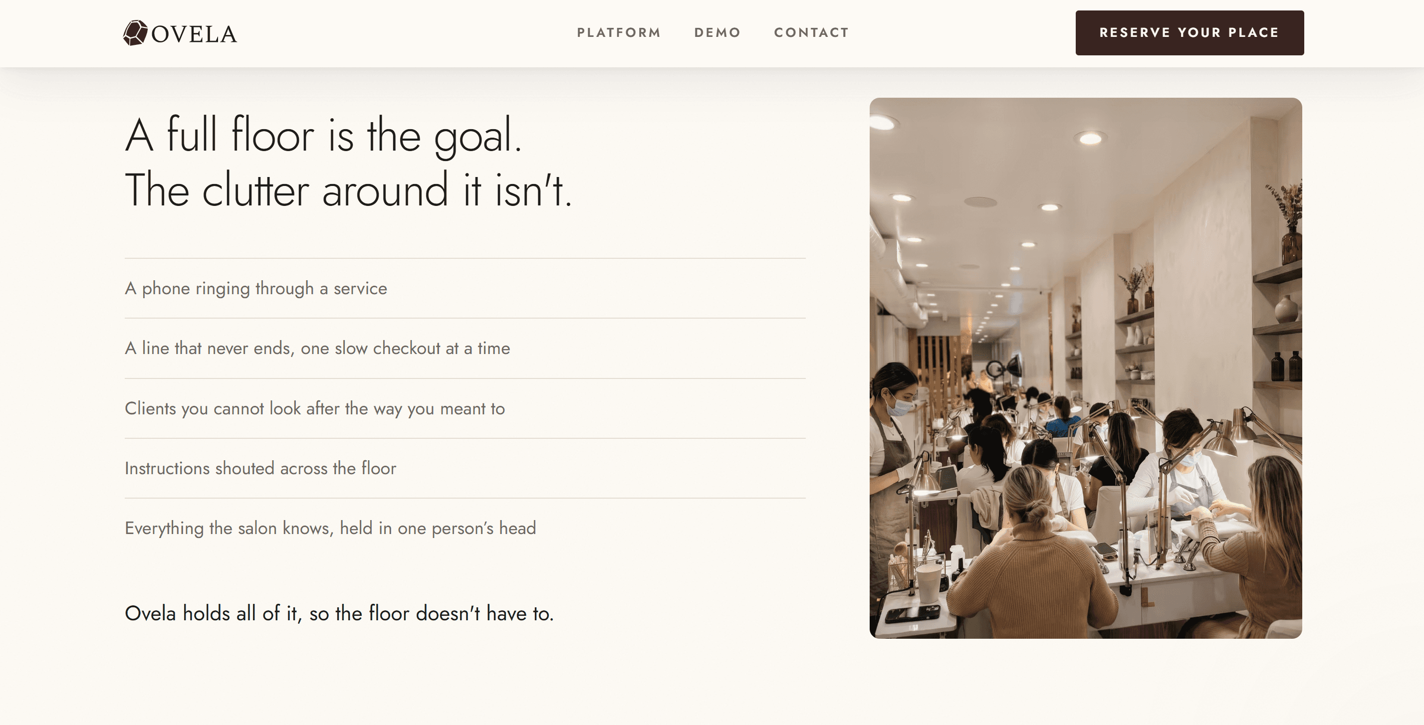
OPAL DARK → OVELA LIGHT
⋆。°✩ THE REBRAND ✩°。⋆
01
Made light mode the default, more accessible and a better fit for the premium feel.
02
Added motion so the page feels alive without getting in the way.
03
Brought in the photography they sent to warm up the brand.
04
Built the sections their brief called for but the site was missing.
Before

After
06 / OUTCOME + REFLECTION
MY ROLE ⋆。°✩
✩ Started as UX/UI consultant (critiques and recommendations with reasoning), became the team's only designer
✩ Designed the Ovela logo and visual identity
✩ Switched the interface to a screen-legible sans-serif (Spectral → Jost)
✩ Ran the full palette through WCAG and proposed accessible replacements
✩ Built the Figma design system and the POC components now in the live demo
✩ Rebranded the Next.js site (OPAL dark → Ovela light), added motion and photography, and completed the missing brief sections
✩ Coached three engineers until they adopted the system as their standard
REFLECTION ⋆。°✩
✩ AI can make a product look finished long before it's usable
✩ A design system's real job is making the good choice the easy one
✩ Accessibility is a series of small defaults, not a final audit
✩ The more accessible default is often the more premium one too (dark → light)
✩ The best outcome wasn't a screen. The engineers now start in the design system and check contrast on their own, and they adopted it as their standard.
